Drum roll, please. I give you: THE ILLUSTRATED POETRY ILLUSTRATION TIME CHALLENGE!
The requirements are simple:
1. Draw a picture.
2. Include a poem to go with it (the poem can be your own or one you like that someone else wrote). It’s that simple.
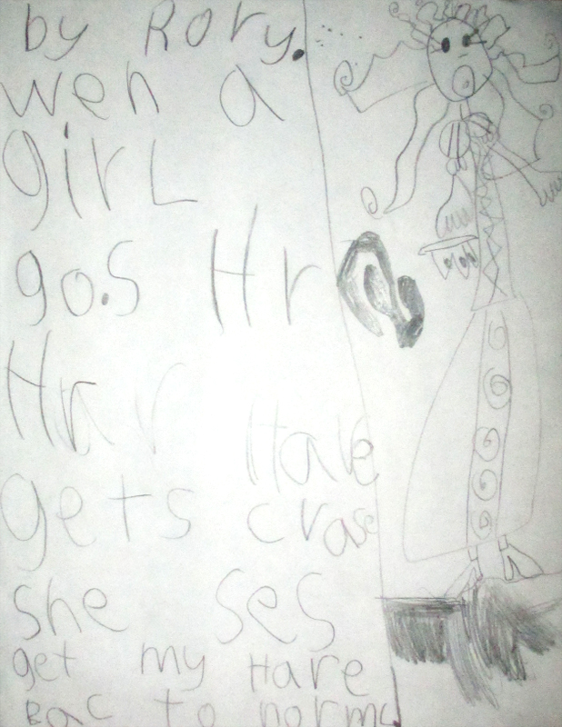
This is a guest challenge because my sweet lil’ daughter, Rory (who’s art has graced Illustration Time here and there), suggested we try doing an illustration combined with a poem. When I asked a couple of the other core contributors to our blog they were down with it. And so it is. So get yo’ scribbles on, Illustration Timers!
The above poem, by Rory herself, can be interpreted as thus (as best as I can remember):
When a girl does hair
Her hair gets crazy
She says:
Get my hair back to normal!
The challenge up on Illustration Time is for us all to illustrate our power animals. And while I like to think of myself as something of a grizzly bear due to certain personal characteristics mainly revolving around my rather ursine attitudes, if I am being honest with myself I am a coyote to my core.
Coyote’s have always held a strange fascination over me. The ghost in the woods, the gray dawn, the illusive sneak thief. They are beautiful and mysterious, and at the same time strange. They mate for life, hunt as a loner, and only get insanely violent when cornered and left with no other choice but to attack and kill. At all other times they are avoidant when it comes to people and even other animals.
I have always felt a very strong connection to animals and the more superstitious part of my being regards them as omens hailing change. I’ve only ever seen one in the wild, and its beauty, its strangeness has locked the memory in place forever it seems.
So there’s that. I am a coyote. Because I am a loner, a non-aggressive till challenged and at times rather mysterious I suppose. Can’t say I’m completely satisfied with this. And I don’t know why I have to do everything in blue…the next one will be in pink, I swear.
I also write bad poetry from time to time. I always post it as it’s written in the journal, hence the terrible hand and the scratched out words. 😉 ————>
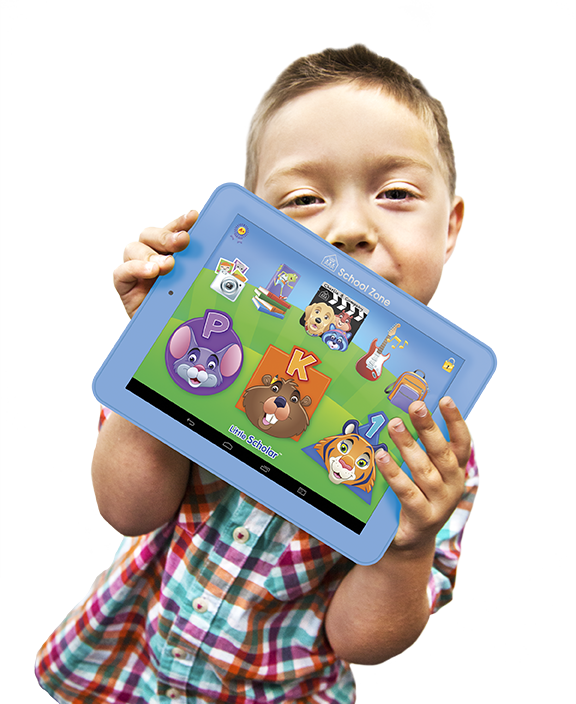
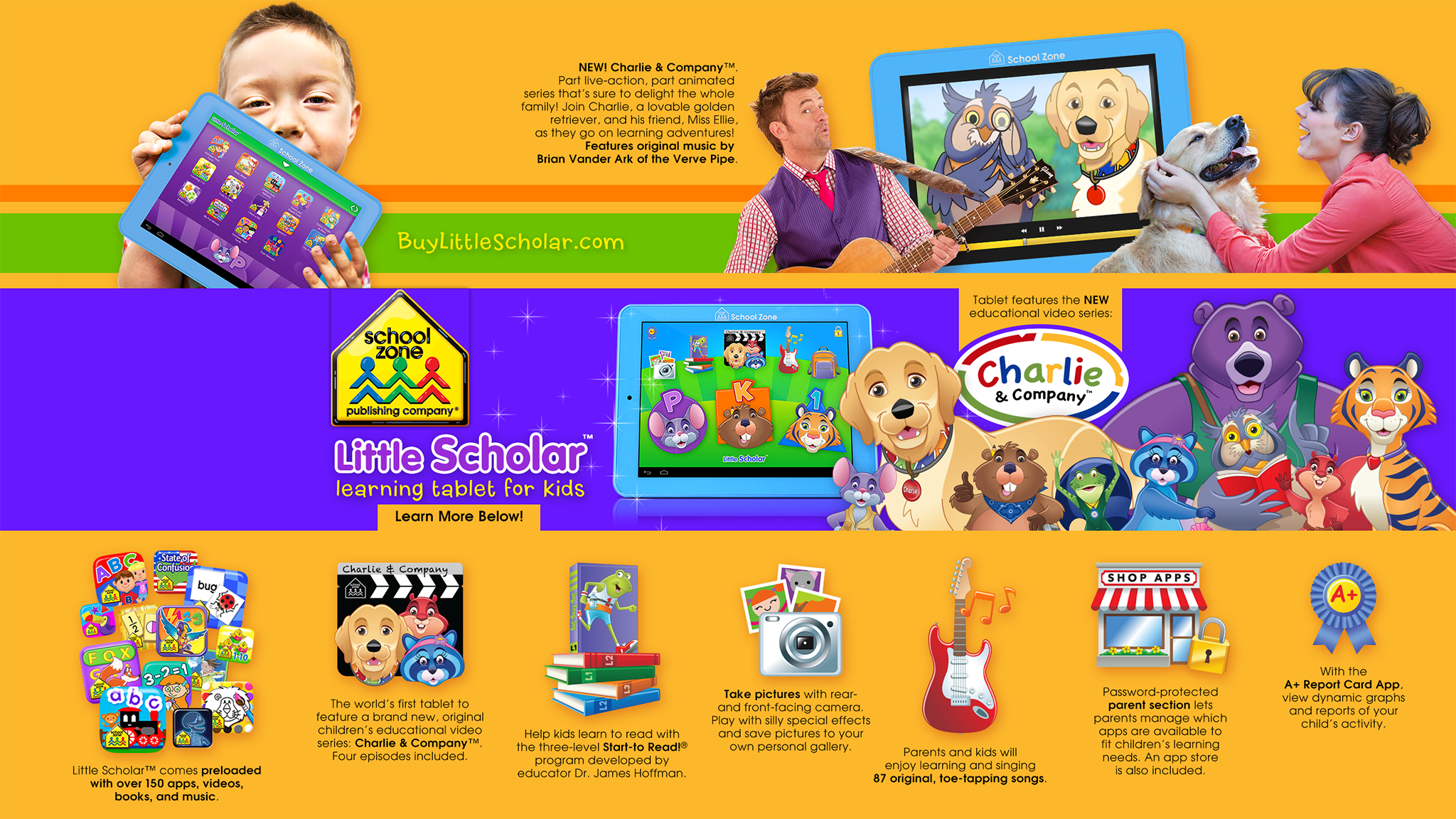
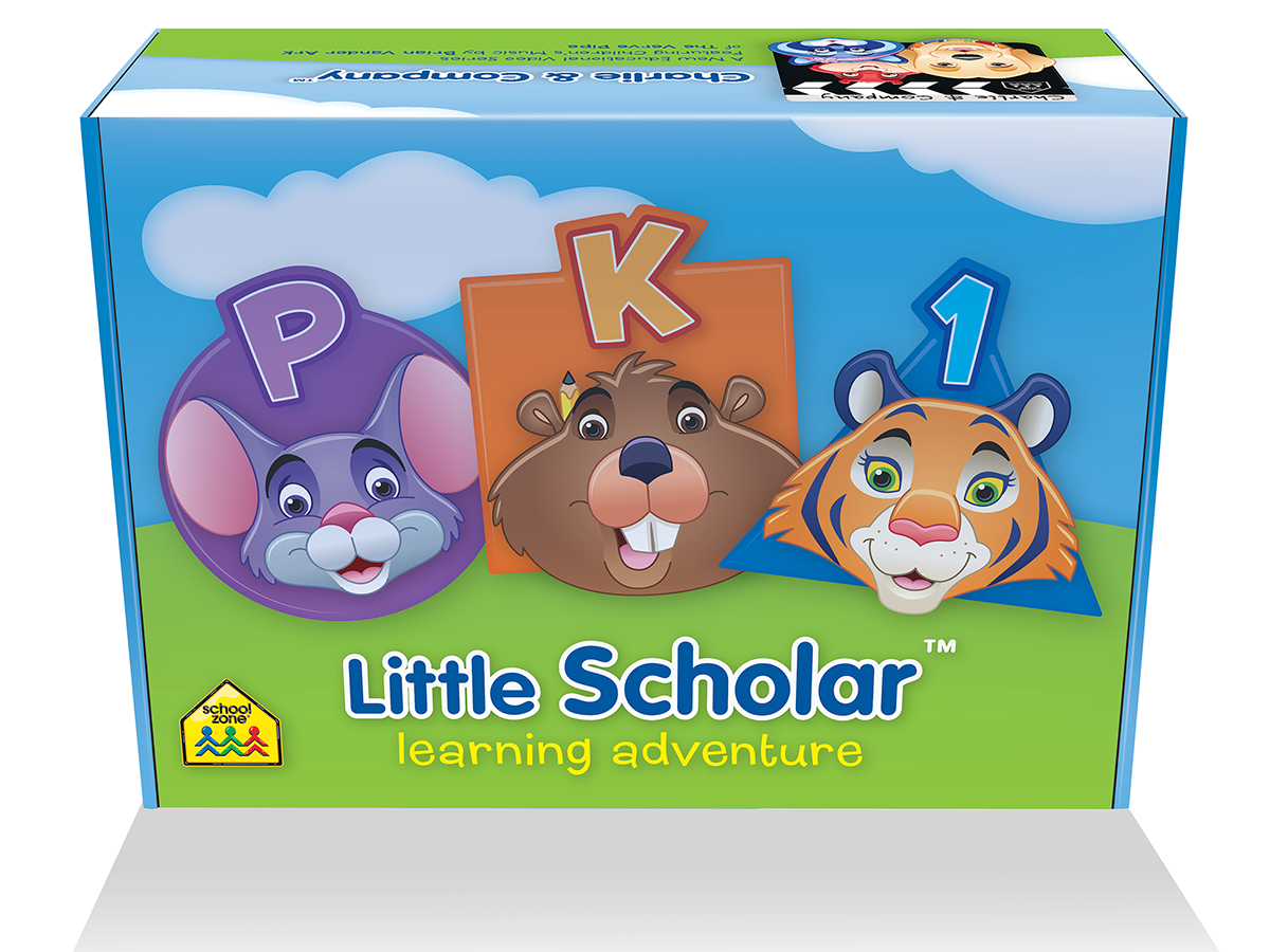
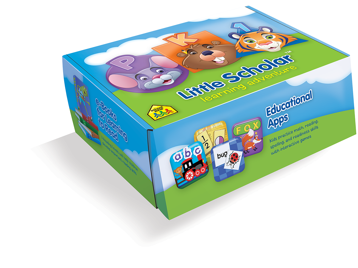
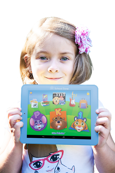
They say it takes a village to raise a child. In this case, it takes a team of really creative people to build a sweet, preloaded, educational tablet for kids. Allow me to introduce you to Little Scholar™. For all of the apps, videos, songs, storybooks, and more on this device (requiring no additional purchase), at $199 this thing is a steal. That’s my son up there by the way, the photograph is by Adrianne (or A. Adelle as she’s known on the side bar).
Visitors to this website might wonder what the regular artistic contributors to Illustration Time actually do for a living. Believe it or not we’re not paid to draw mermaids and cryptids—we just do that in our spare time. The six of us regulars (featured to the right) are some of the creative employees of School Zone Publishing. We’re composed of graphic designers, illustrators, animators, and more. Each of us has multiple artistic strengths and abilities. With our powers combined, we get some pretty awesome children’s educational product out the door. Because Little Scholar™ is our most recent (and epic) collaboration as a company, I thought it would be nifty to share a little about the device, from the standpoint of our creative efforts.
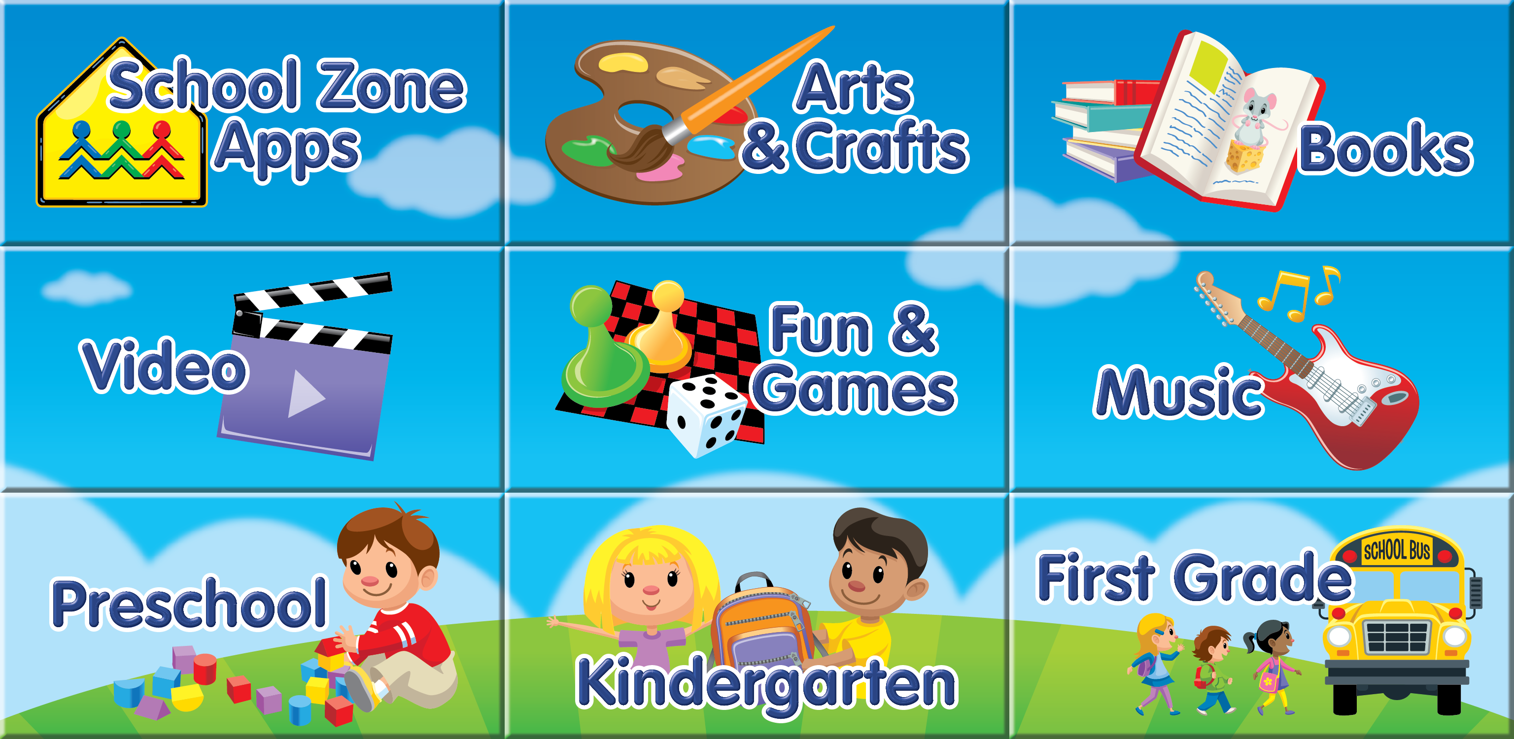
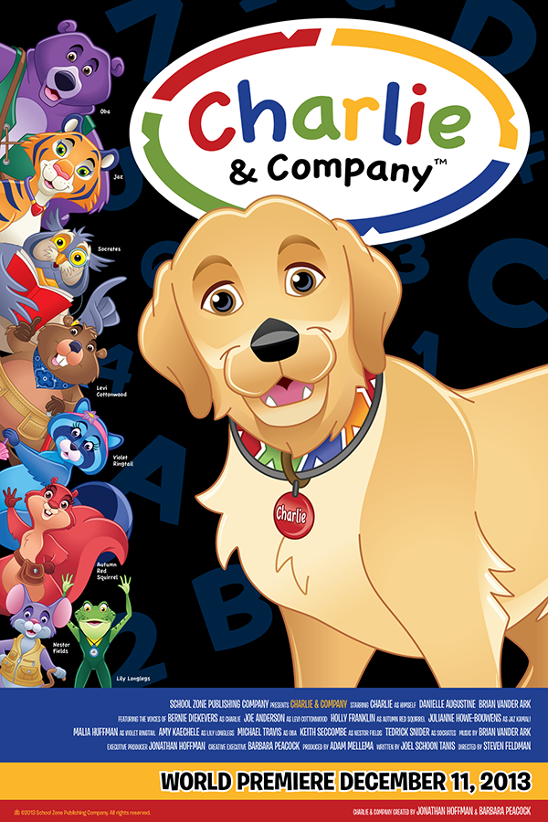
Above you can see our YouTube channel art. This was one of my recent design assignments for this project. The image communicates the scope of what you get when you buy a Little Scholar™—tons of full-version apps, videos, a whole Start-to-Read® program, a camera, songs, access to a store for more content if you want it, and a reporting app so parents can monitor the device usage by the little ones. Notice Brian Vander Ark from the Verve Pipe up there? Yep, that’s really him. He made the music for Charlie & Company™, a brand new educational show debuting on the tablet (you get four episodes with the device). With animation and live action, viewers meet Charlie, a golden retriever, and his friend Miss Ellie as they go on learning adventures.
YouTube requires a complex layout for channel art to accommodate several kinds of viewing. Online or on a device you’ll only see the design encompassed in the purple strip above. But if you’re viewing School Zone’s YouTube channel on a t.v. you’ll see the whole design (hence the additional graphics in the yellow area). It was quite the fun assignment to build a layout that accommodated all of these variables in one image.
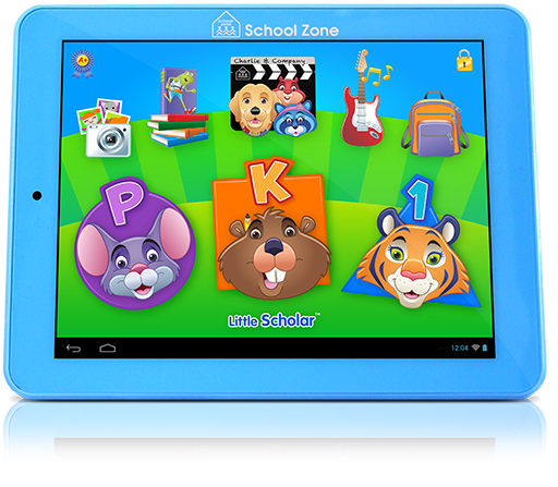
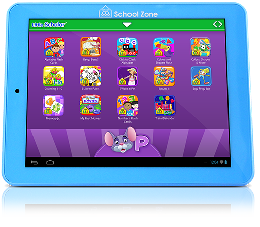
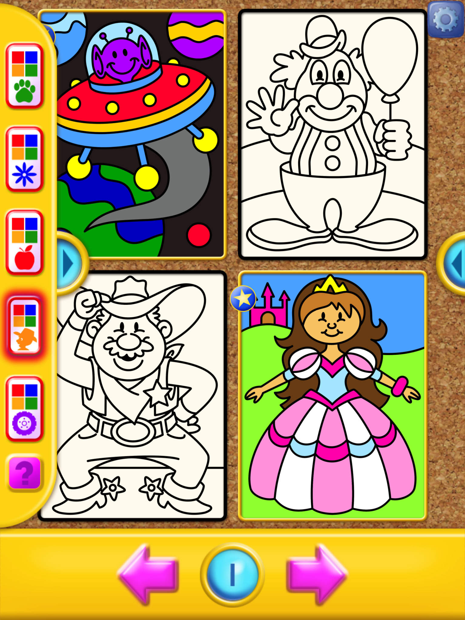
Here’s a closer look at the device. Terry is responsible for the awesome illustration work—characters and icons—while I did the user interface (UI) design work for the OS (that means the look of the menus the child navigates while using the device). It’s meant to be a bold, fun, inviting sort of playground for the kiddos. Each icon gives a playful and obvious cue as to what’s in store in each area. You can also see that the device spans preschool through first grade. Below are the menus for each grade level, showing the apps packed into each. Note the color and character cues used to help the kiddos identify which area has been entered into, matching the main screen’s buttons:
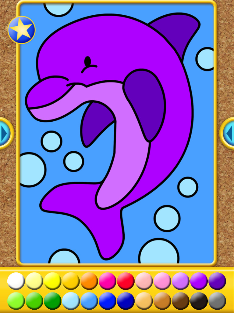
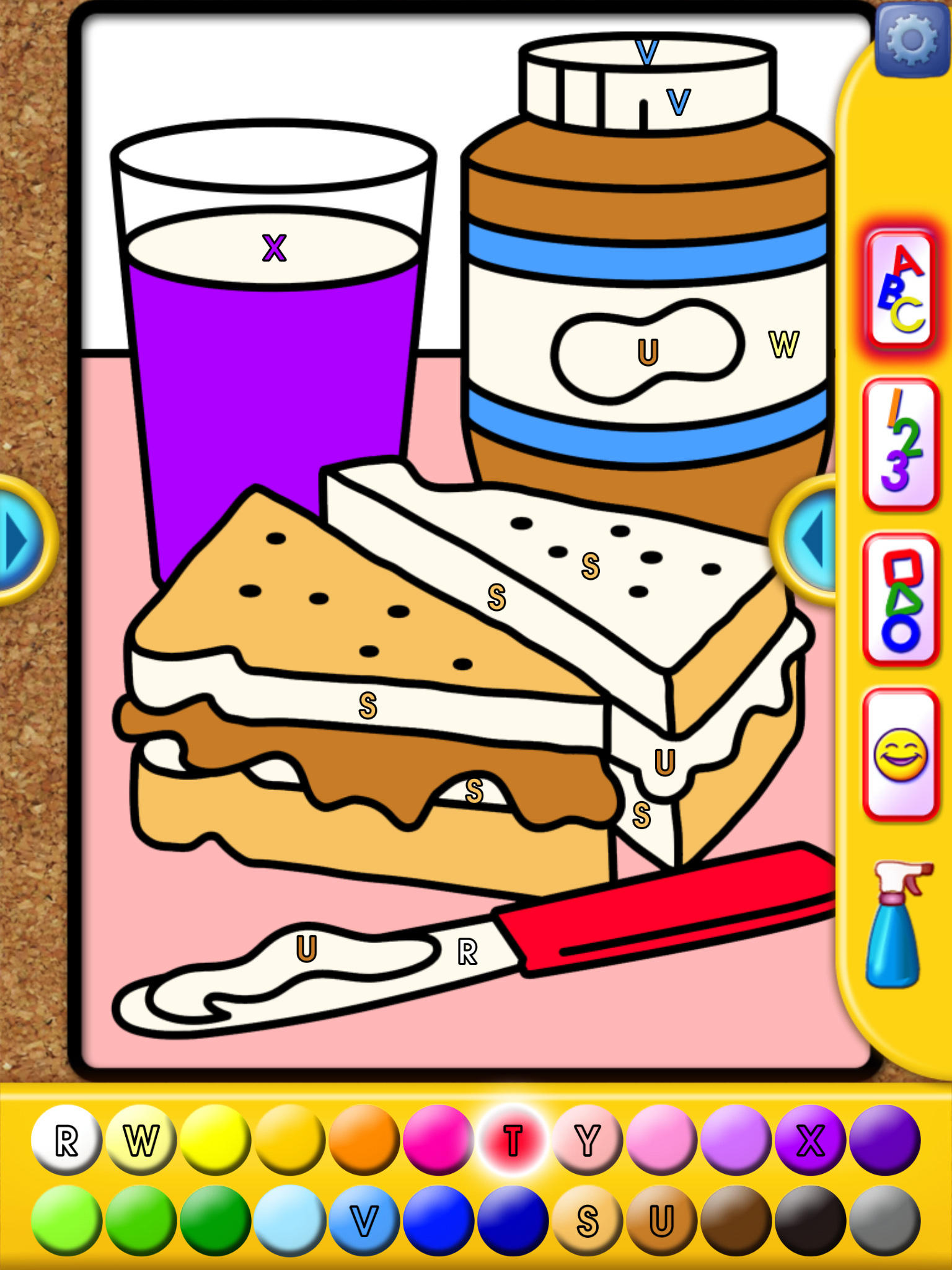
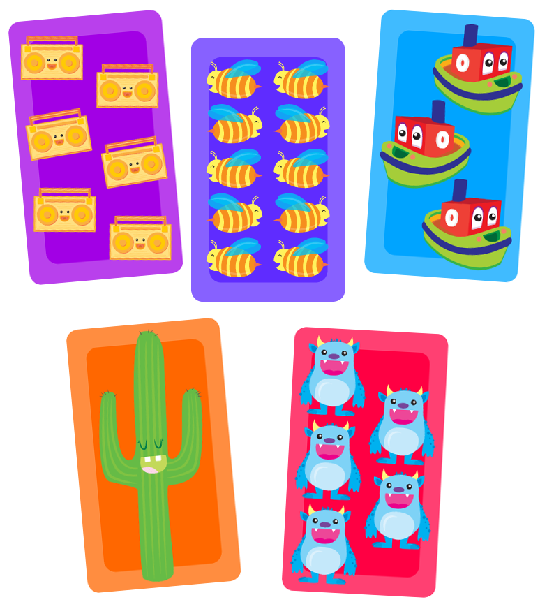
A ton of work went into porting over existing School Zone content for the device. For instance, McCoy was the lead designer on I Like to Paint, a creativity/coloring app that you get with the device. Below is the icon he developed as well as sample screens of the UI. The UI McCoy developed is gorgeous, bright, and simple. My kids love this app, which is the true sign of a successful design for kids. Terry did the illustration work for this too.
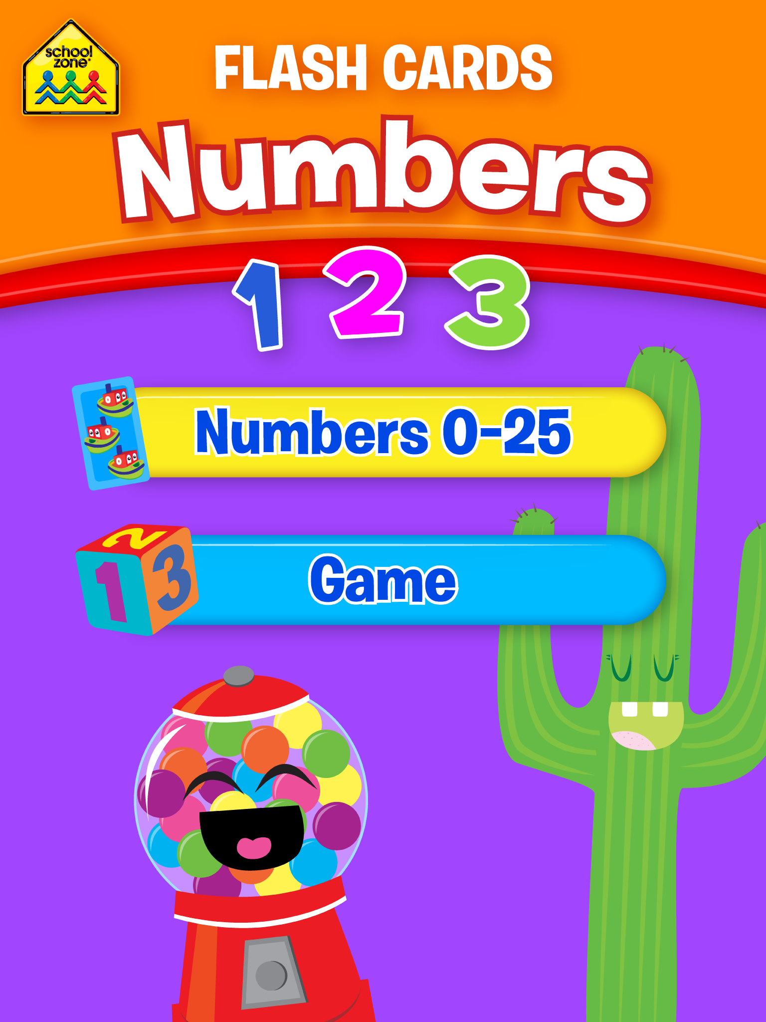
Another brand new app, among several newbies, is Numbers Flash Cards, seen below. Again, all of this work showcases our team effort as well as the fact that we have very multifaceted personnel. For instance, although Adrianne was utilized for her professional photography skills, she also did the illustration work for this one. I did the icon and menu design work for it. At the bottom of this group of images I picked out five of the very cute flash cards she illustrated. One of the most enjoyable aspects of School Zone is that our employers are willing to give us opportunities to work in more than one creative department. Often our efforts to “try on a new style” lead to additional in-house opportunities.
I could feature a lot of other apps that we developed and/or tweaked for inclusion in Little Scholar™. But I just wanted to give a small taste of the monumental, loving care that went into this project. Here’s one of Joe’s awesome contributions. Besides animation and/or design work on several apps, he was also tasked to develop the interface design for the app store on the device (in case someone wants to get more School Zone content, or in case they’re looking for some Angry Birds or whatnot). Again, the illustrations are by Terry:
I haven’t talked enough about Charlie & Company™ yet. For this amazing new kid’s show, Terry did a lot of character design work, including the rendering of these very polished editions of the show’s cartoon characters. Below you can see a couple of large movie poster designs I got to layout that were printed for the premiere of the show (our boss wanted two poster designs for the event). I developed Charlie & Company’s logo design as well (created to match Charlie’s collar):
But what is the show like? Our crack team of animators brought Charlie & Company™ to vibrant life. Jessica was the ink and paint lead for the show’s animation. McCoy also did a lot of the animation work. I’ve got to mention Keith and Michele here too (we’ve yet to feature them on Illustration Time for their personal work). Keith not only led the animation team’s efforts for the show but also worked with Terry on the character development. The love and care he put into Charlie and the gang is very palpable as I view these characters. Michele is another experienced animator that helped to produce the animation work. They all did a great job. Here’s a clip of the show to prove it:
As a couple of last inserts, here’s a look at some package design images (another one of my assignments for the project). Following that is a cute shot of my daughter holding the device, again taken by Adrianne.
We’re very proud of our accomplishments with Little Scholar™. My wife and I got to test it on our kiddos over the course of its development. The finished product is a gorgeous work of art, super-durable, fun, and educational for kids—an amazing value at a great price. And it comes already jam-packed with superb content. School Zone has stood for quality educational products for decades, and you can capture a mighty part of that empowerment for your kiddos with this device. Check it out further at this link:
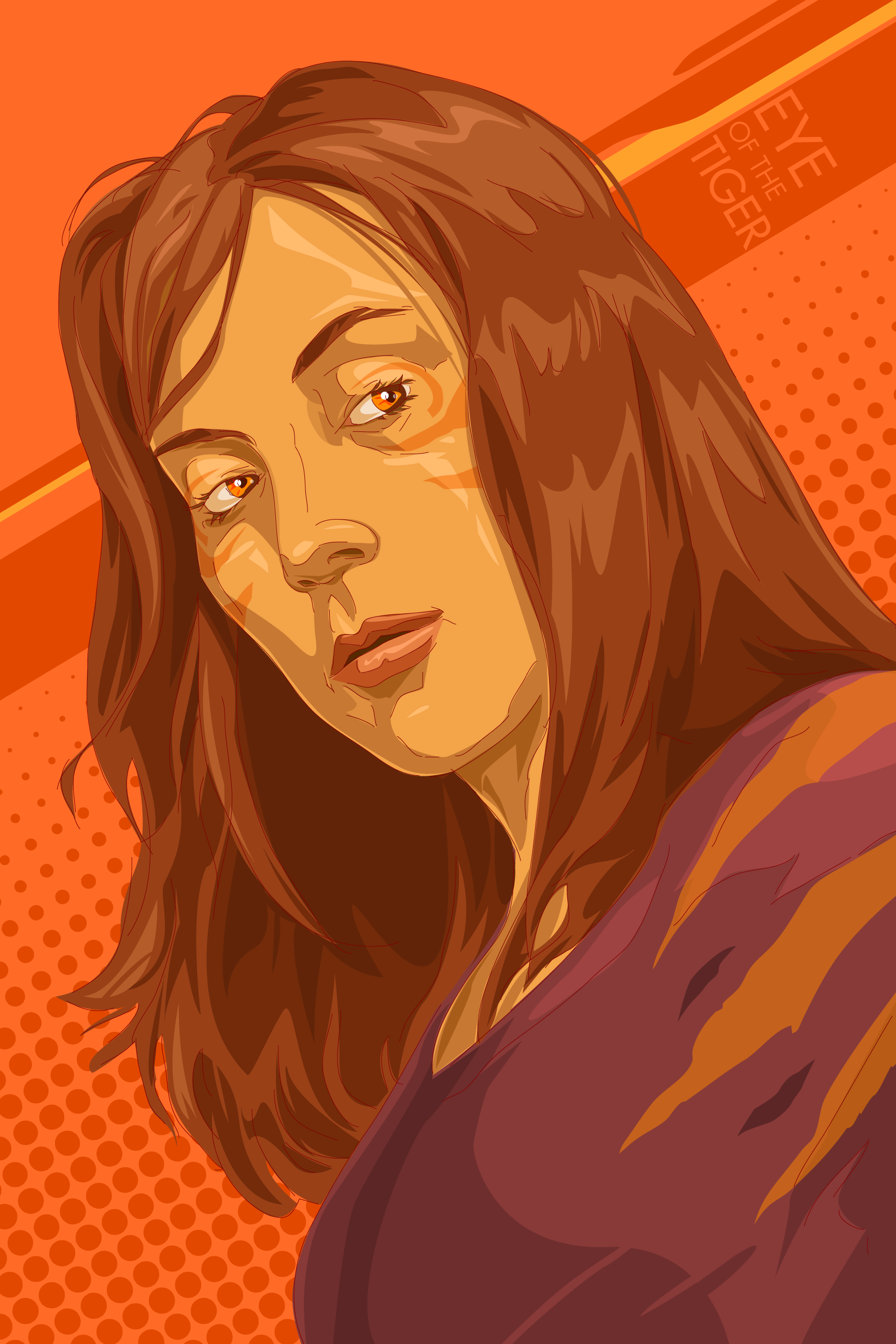
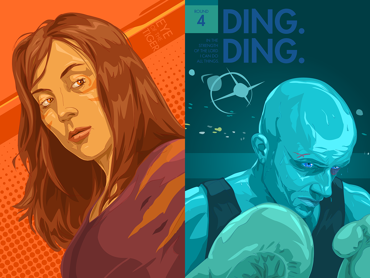
While I was working up Ding. Ding. my sweet wife said something like, “If you get to be a boxer, what do I get to be?” She followed that up a little later with the sentiment, “I want to be a tigress.” My sweet wife is surely one hot tigress. Not just for my attraction to her, she keeps our home working, our kids alive, and my sanity intact—she’s basically a super hero, with the eye of the tiger. So this is a companion piece to go with my self portrait. Tomorrow we welcome our 4th baby into the world. She’s ready for it with super-heroic intensity as usual. Love you, honey!
I found out a little late that November 1st was Self Portrait Day. It’s been a long time since I’ve drawn a picture that’s an obvious attempt at me. I’m no boxer (although I loved my martial arts studies as a younger man), but this is an expression of some big ticket happenings about to explode onto my scene. My wife and I are expecting our 4th baby this Friday (lil’ Jack Fable is on his way), hence the “Round 4.” The scripture is a slightly modified sentiment from the Book of Mormon—about being able to handle the crazy mess of life with one’s faith firm in Christ. Being a good dad is a challenge indeed. You have to be on your game, because there’s a lot to distract one away from what’s most important in life these days. The “Ding. Ding.” is a reference to Apollo Creed from the Rocky films, expressing that I’m up for it and in it to win it. Daddy life can be tough business (if you’re doing it right), but it’s so very worth it, and very often it’s a hoot. The dividends of love that you get from all of the work involved are a wonderful investment, not only in your kids but yourself too—it’s the best training for your spirit that you can get. This post may be a little personal, but hey, it’s a self-portrait.
I didn’t see Alien as a youngin’ I actually saw it with my folks for the first time when I was in college! I was terrified! But it was such a rush and I enjoyed the mythology so much that I own all the collector editions of the films and they are some of my favourite movies. Because I am a big scaredy cat, I can’t watch the movies alone and have to be in the company of others or else it’s just to intense for me.
I tried to depict Ripley in this poster as I feel she and the rest of her companions are in the movie : completely, and utterly alone out in the middle of cold, dark space.
I have two versions here. One is the fogged version which would probably be the final and the second is the non-fog version that I love because it is so much crisper. Which do you like more?
This one’s for my sweetheart, Bethany. Her favorite movie is the Tom Cruise epic, Legend. As my wife and I discussed what the concept to encapsulate the movie should be, she suggested that gorgeous moment of transition when Blix, the foul-hearted goblin, destroys one of the unicorns. I like that Blix and the unicorn are the metaphorical “hands” of the forces they represent—Blix is the hand of Darkness, while the unicorn is the hand of all that’s good and pure. One of the most impressive elements of the film for me is the crazy amount of leaves, wisps, and what-not you can see floating around so many of the frames of the film. For my fellow geeks, below is the Unicorn Theme by Tangerine Dream that was part of the soundtrack I listened to while creating this artwork (if you want to play something while taking in the image). Happy Thursday! More posters for the challenge are in development, so stay tuned 😉
We’re giving ourselves a little bit more time to complete this one, since it’s an ambitious challenge: a montage movie poster (so expect to see the entrant efforts to start coming in a few weeks from now). The only requirements are 1) that each piece somehow display more than one character, and 2) the poster should incorporate the logotype for the title of the movie. It can be fan art for a favorite film, or the movie can be something completely original by the artist.
The reason I’m choosing this for our new challenge is a) to challenge us creatively, and b) because my favorite place to dwell illustratively is on the line between illustration and design. This type of project fuses the two disciplines in a way that will force careful compositional planning while inviting engaging figure work. Here are some stunning examples of movie posters that I like to grab your attention about this cool type of art:
Aliens (Poster Art) by Ken Taylor for Mondo
The Little Mermaid (Poster Art) by Tom Whalen for Mondo
Iron Man 3 (Poster Art) by Martin Ansin for Mondo
Conan the Barbarian (Poster Art) by Jason Edmiston for Mondo
As you can see, I’m a huge fan of Mondo and the work their artists produce. If you check out their site archive you’ll find countless ways that those artists have created gorgeous designs and illustrations to celebrate some cool movies. Some are iconic in simplicity, others are near baffling in complexity. Challenge on!
Some sweet cryptid entries have checked in already. I just got mine done this evening for my sweet lil’ daughter. She loves fairies and she loves Paris (and fairies do fit the general cryptid definition we’ve got going). So I give you the Paris Fairy (it’s supposed to be pronounced with authentic Frenchiness: Pear-ee Fair-ee). If you review my daughter’s cryptid drawings I think you’ll now be able to recognize her Paris Fairy effort too 😉
It’s my turn to pick the next challenge which I’ll be announcing very soon. Illustrators beware: it will be a challenge indeed… Mwuhahahaha… Mwuhahahahahahahahhahahaha!
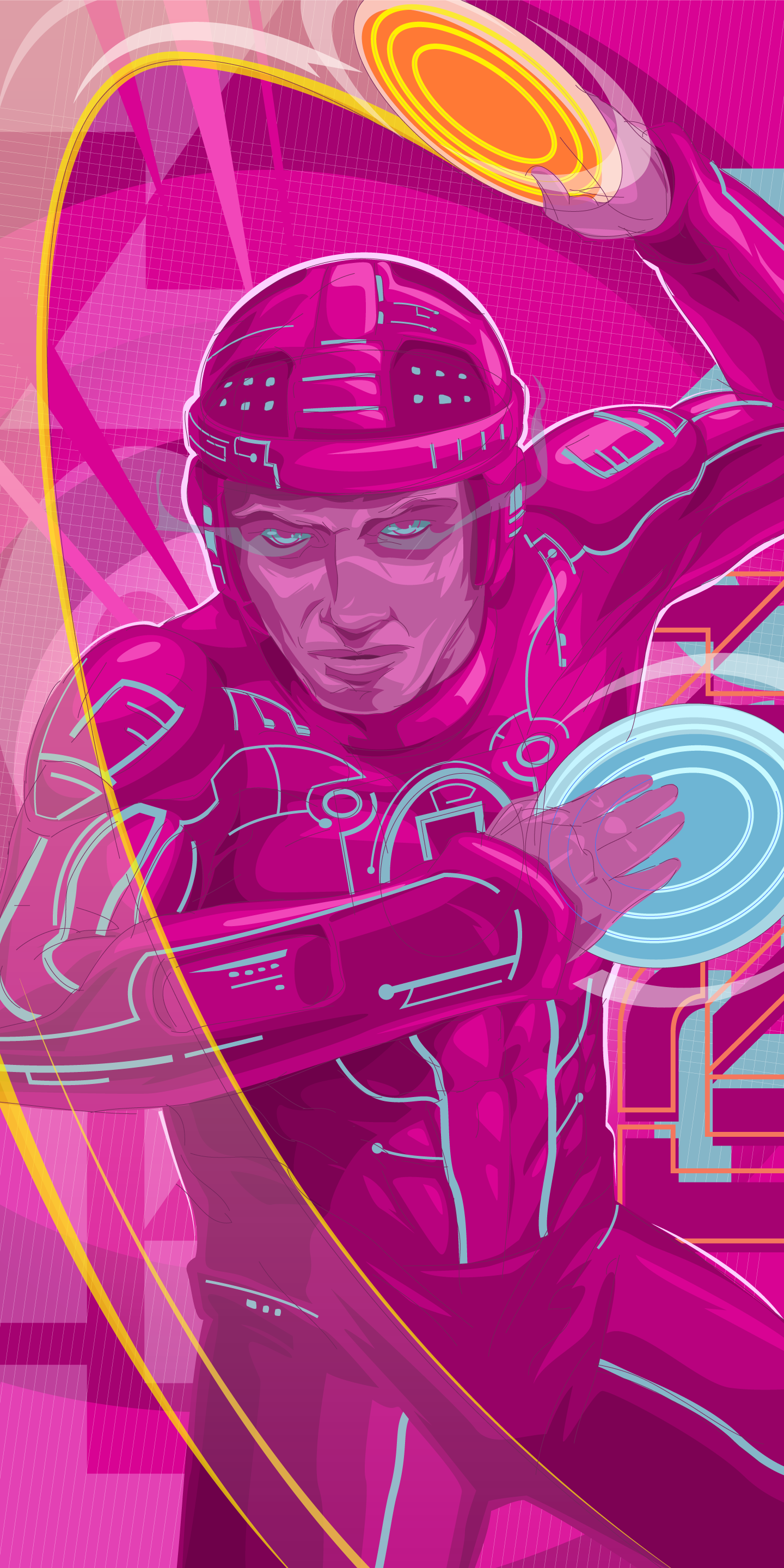
Tron made a huge impact on me as a kid. My dad showed my bro and I the movie, we had the glow-in-the-dark action figures (made of colored, clear plastic mind you), and we even listened to the vinyl record of Wendy Carlos‘ score for the film (I still listen to it). It’s more than nostalgia to me—it even influences my design work today. Something about the simplicity of shape, line, and color used in that movie has kind of seeped into a lot of the art I’ve made over the years. And when I listen to that soundtrack (or the Daft Punk follow up from 2012, also amazing) I feel like I’m on the grid while I do my design work—it enhances reality for me. So this is my ode to Tron—a fighting program who just caught someone else’s identity disc (a play on the whole identity theft idea). It kind of hints at the truth behind the yin-yang too—we all hold close to our hearts a way of being, but there’s always the opposite color of choice flying at us, ready to be caught. Happy Friday.
If you really want to geek out the way I do when I work on things like this, play the music link below as you view my piece. There’s often a sound-scape fueling my creativity as I lay down my shapes and pull vectors.
 Drum roll, please. I give you: THE ILLUSTRATED POETRY ILLUSTRATION TIME CHALLENGE!